Tools Used
Figma
Clip Studio Paint
2023
I was responsible for all aspects of this design process including; planning, asset creation/collection, typography, wireframing, final design and prototyping.
Typography:
One of the early goals of this project was to reestablish the typography used in the menus and text throughout the game. The theme that's initially put forward in the game is to have the typography look like calligraphy in a journal. However, that font style is mixed seemingly randomly with a San serif style font, which disrupts the immersion. It leaves the user feeling like there's computer text in their old-world journal and pulls the user out of the game. Additionally, the stylized calligraphy font is not in a color that calligraphy ink would be, such as black, instead it's in brown which again pulls the user away from feeling like it's realistic. Furthermore, sans serif style font is also colored brown leading to very poor contrast that fails AAA visual standards for anyone with visual disabilities.
Solution:
The solution to this problem started with reviewing the mood that was trying to be conveyed in the overall gameplay. I already knew that I was going for a more modern and sleek approach so the first thing I needed to do was find a font that read clearly and had a feeling of the RPG style. For this I decided on the ‘Magic cards’ font, which is a known font in the fantasy community and reads clearly at any size. In keeping with the original design for the stylized fonts, those were reworked to be easier to read and create hierarchy when used.
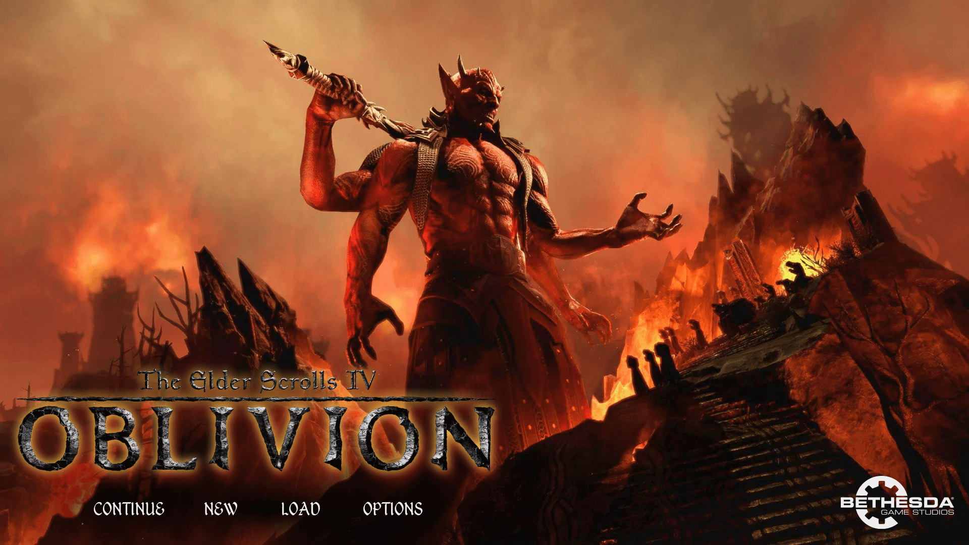
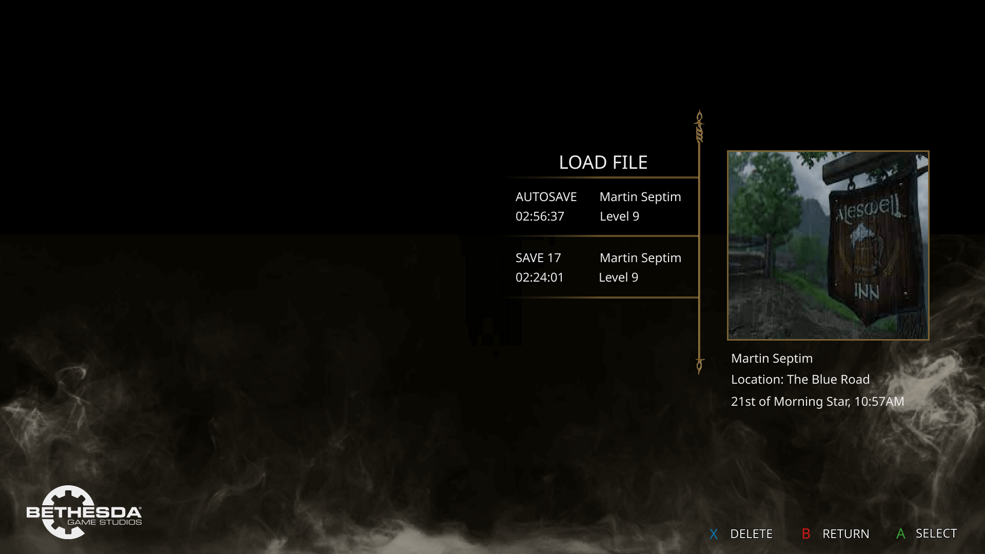
Title page & loading screen:
The title page and file screen were particularly important in the design process because it's the first experience the user has with the game. It sets the tone, the mood and the pace of what's to come. In the original design the first thing that stands out is that the title page completely consists of brown colors in various tones. Right away it becomes difficult to read the menu options and determine what the user is supposed to do. So, in the first 30 seconds of playing this game the user is already receiving a High cognitive load which only builds as the user plays on. Furthermore, because of the issues with topography, hierarchy and clarity are poorly displayed and increases the users' strain even more.
Solution:
The solution to the title page and file screen began with shifting away most colors from a single hue and introducing some game artwork to create a more interesting initial impression. Additionally, moving the title logo and options to be left centered instead of middle centered, which creates a more organized feeling. The load file screen is the first page the user goes to after the landing page, so it was here I wanted to establish a more simplistic and concise style. By removing excess, unnecessary, design elements and increasing clarity it provides a more modern and clean mood to the game.
HUD & On screen dialogue:
The on-screen dialog system has always bothered me personally and is an issue with others I interviewed as well. Oftentimes when the system is used the lack of background-to-text differentiation makes legibility very difficult. Also, the icons used to indicate different possible actions such as persuasion are not labeled so it's easy to forget or not know which each symbol does.
Solution:
The solution to this was to create a semitransparent black background behind the text options that the player can use and bring it into view better. The unclear icons are replaced with labeled text and button options for clarity, and the text that the character speaks is displayed underneath them along with their name.
Character creation:
For the character creation menus, I decided not to redesign the initial page and instead focused on redesigning the class and birth sign menus. These menus feature beautiful artworks but are distracted by poor use of color and topography like the starting menu. There's an excessive use of browns in different tones and the topography leads to an inconsistent hierarchy. Additionally, the use of highlighted blue text feels misplaced and pulls away from the immersion. Something that I picked up during interviews was that players really enjoy an opportunity to hear more lore and flavor text around some of their favorite features, which are painfully lacking on these screens.
Solution:
The character creation menu is always a very fun process in starting a new game, so I wanted to ensure that it was made as easy and effortlessly as possible. I started by focusing on redesigning the layout, providing more room for information and imagery and creating a cleaner more updated style. By using a semitransparent black background and white text, legibility is greatly increased and by adjusting the fonts, hierarchy is better established. Furthermore, this opened room to increase the size of the artwork and showcase the wonderful flavor text around the subject matter. For the text and picture, I use a golden ratio layout and carousel wheel for selecting different subjects.
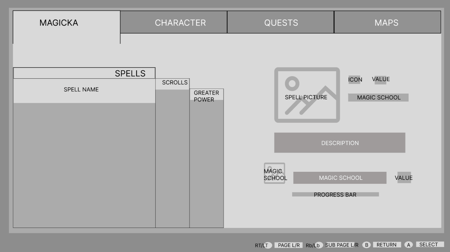
Inventory, quest & character menus:
The most extensive portion of this design was in making the inventory, quest and map menus. The main pain points with these systems were the lack of clarity among the different pages that could be accessed on each menu. The icons don't list what the section information is about, and it becomes very confusing to navigate through the pages. Again, as with the other menu systems the typography leads to very little clarity and builds frustrations when using the systems.
Solution:
To improve these menu systems, I knew it was important to scale back some of the stylized features such as the wooden background and clipboard effect with paper. And instead went with a clean and sleek border look with black backgrounds and descriptions of each page and its contents. Furthermore, every item and selection were given an individual description area and larger picture to emphasize the beautiful artwork. One of the main changes was in removing the characters' image from the menus, except for in the apparel selection section. In the original design, any page you go through in the inventory will still show the character in the background which is unnecessary and distracts from what the user is trying to look at. By changing this the user can now focus and concentrate on what they need with limited cognitive load.
Results:
So far, this project has received positive feedback and users have been excited to see how easy the new system is.
Moving forward, I would like to create mockups of in-game use for the new UI system using a program such as Unreal Engine 5 to get a more accurate feel. Eventually it would be fantastic to see this molded into an actual oblivion game and become a downloadable mod for players.


.png)